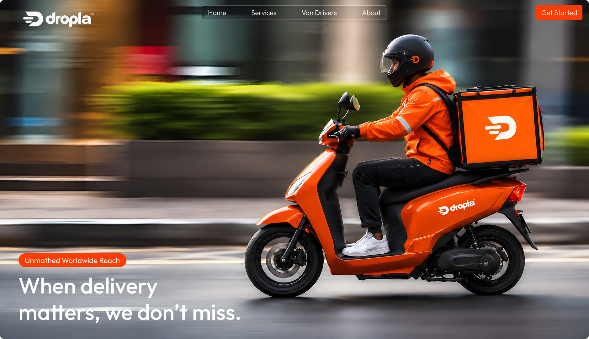
Dropla
UI/UX Design, Product Strategy, Logistics Experience
Dropla is a delivery platform designed to make every handoff visible, predictable, and easy to trust — from pickup to doorstep.
Colour palette
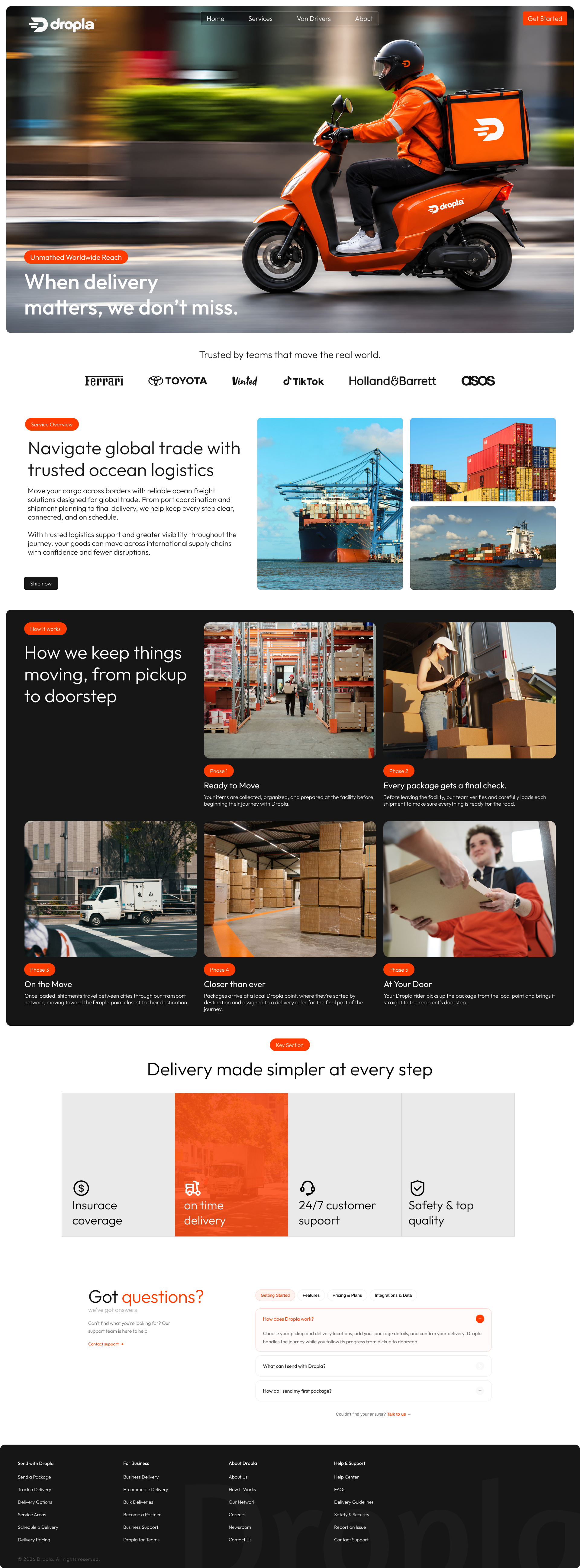
With Dropla, pickup, movement, and delivery visibility become one continuous journey from warehouse to doorstep.
The brief
Dropla wanted a delivery experience that made global movement feel clear. We designed a system where every handoff is visible, calm, and easy to trust.
A clear, continuous delivery experience
Problem
Delivery updates were fragmented across teams, carriers, and customers. People had to chase information instead of receiving confidence.
Solution
One connected journey. Every pickup, movement, support touchpoint, and doorstep handoff becomes visible without making the experience feel heavy.
Project timeline
The work followed a clear path, from framing the delivery problem and mapping the operating experience to prototyping the system and preparing it for launch.
Discovery
1 week
Design
2 weeks
Delivery
3 weeks
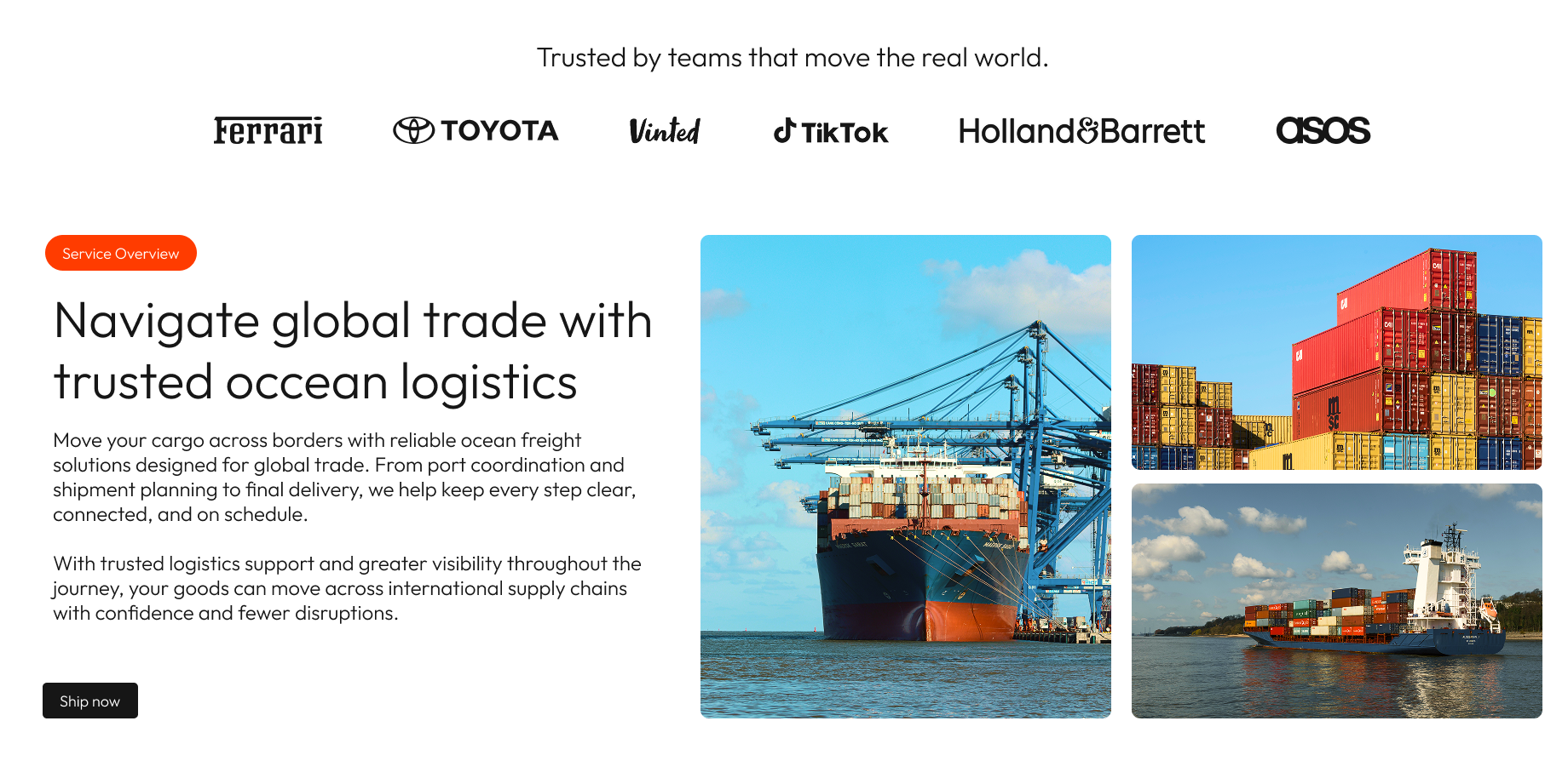
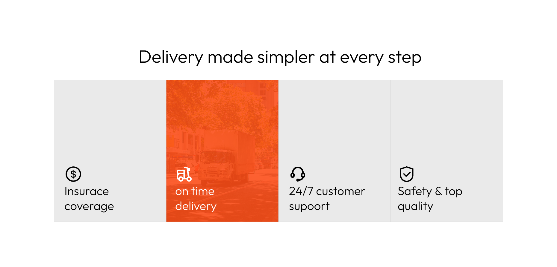
The package moves. The experience stays clear.
Signal. Momentum.
A warm logistics palette built on clarity, movement, and one unmistakable delivery signal.
FF5A1F
Dropla Orange
171717
Deep Ink
F5F2EC
Warm Cloud
6F8E5F
Route Green
Confident. Clear.
A type system designed to feel human at the handoff and precise in the operation.
Satoshi
#FF5A1FSatoshi is the display face — confident, warm, and built for the moments that need to move people forward.
Inter
#6F8E5FInter is the utility face — highly legible for status, support, and operational detail.
Let's make the next move clear.
Bring the problem, the brief, or the rough idea. We will help you decide what comes next.